
Make it stand out.
iGo
A CASE STUDY - 2023

INTERACTIVE
PROTOTYPE:
Social meet-ups, fused with swiping.


People say they are going to an event…
The Problem?
…they don’t show up.
Research and Discovery
Google Forms Survey
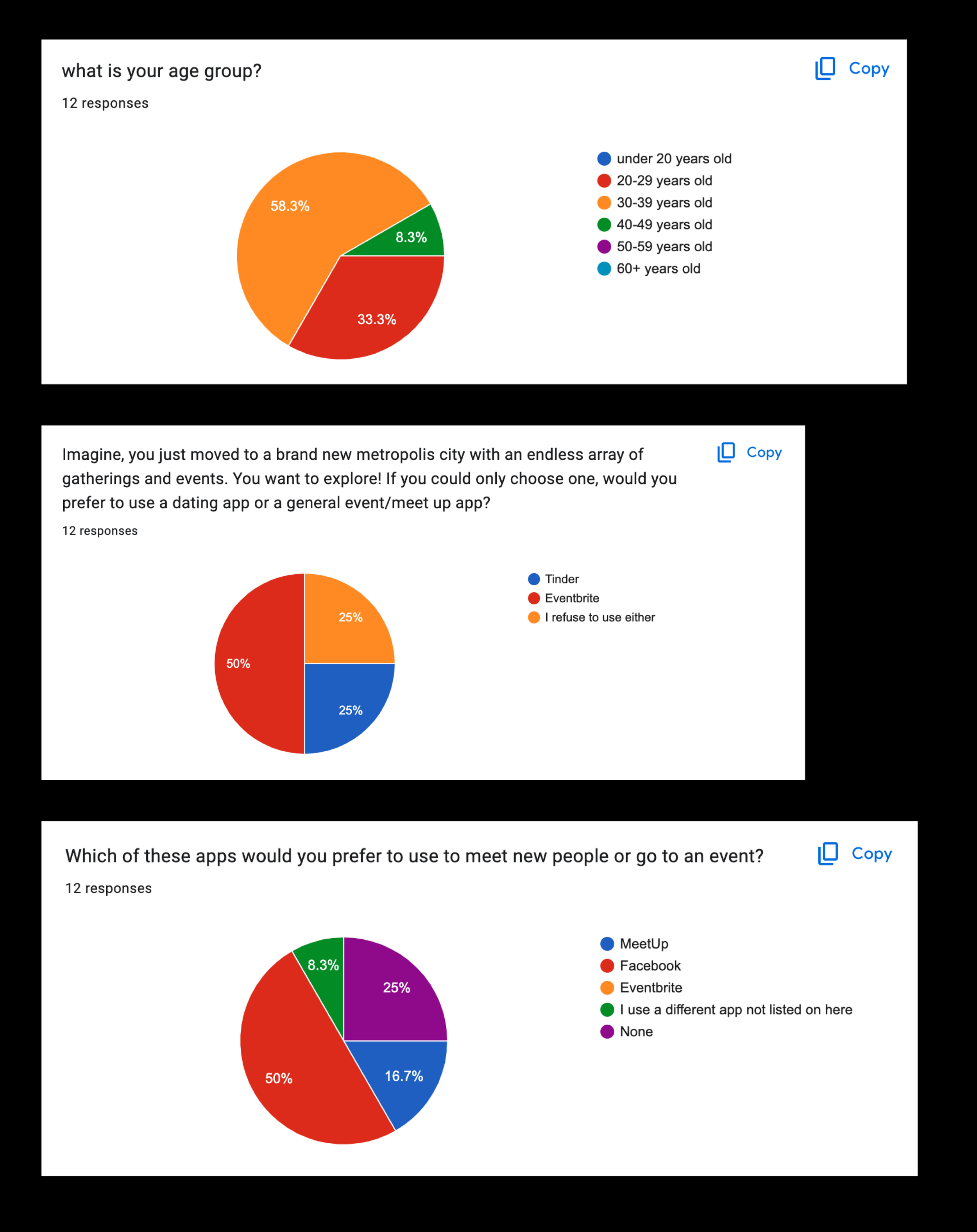
Interestingly enough, 50% of survey responders generally prefer not using an app at all when moving to a new city to meet people.
However, if given a choice between dating app, Tinder and meet-up app, Eventbrite- users preferred Eventbrite.
What motivates users?
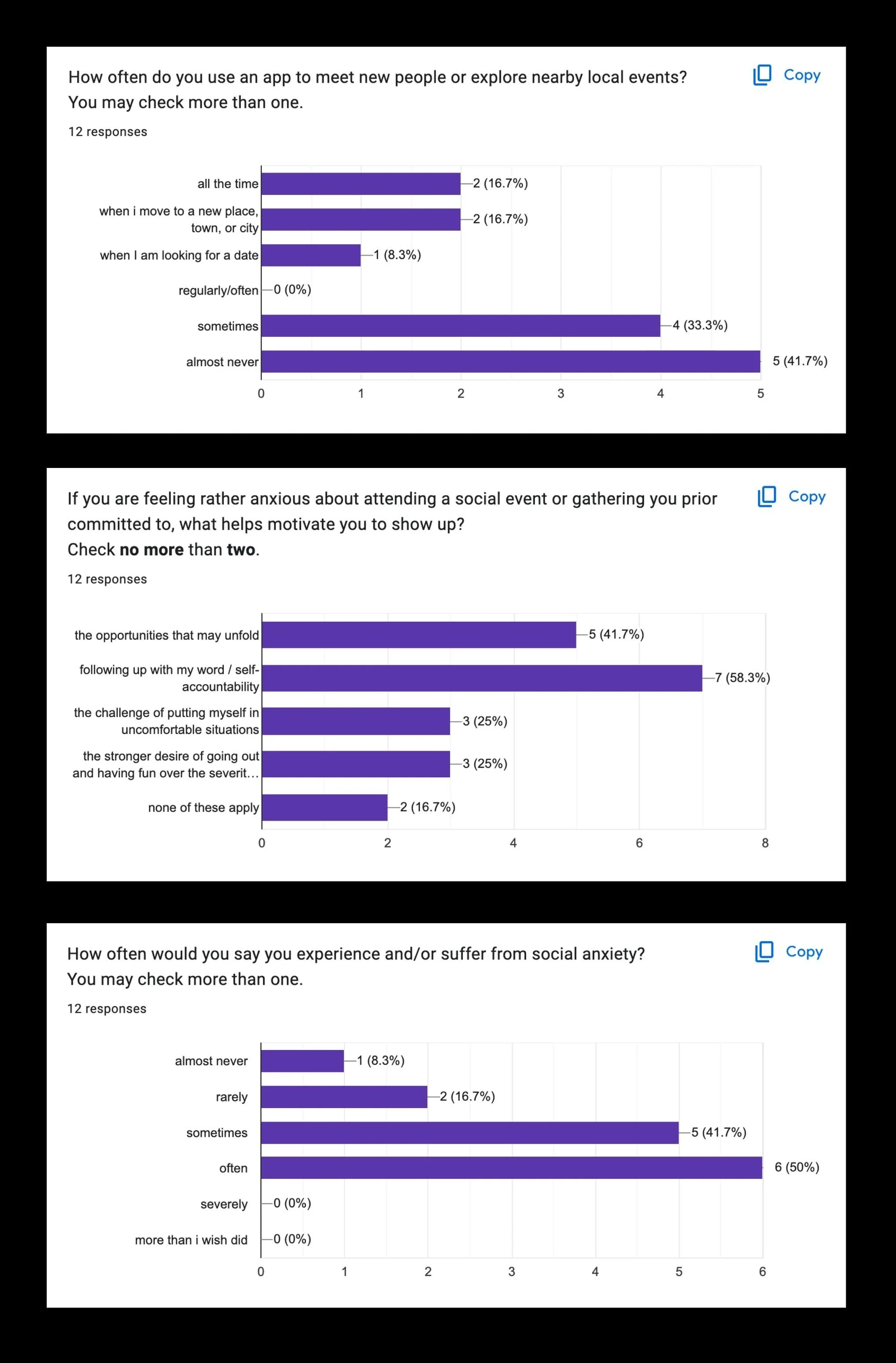
58% of survey responders report that “following up with their word” is what motivates them to attend the event they committed to.
Nearly more than half of survey responders experience social anxiety sometimes or often.
Is being accountable the potential antidote/solution for social anxiety and “showing up“?
Competitive Analysis
Eventbrite

MeetUp

Comparing and contrasting other industry app leaders was a critical foundation for creating the framework for fusing a similar online dating component.
Some advantages of online dating include :
growing a social network and making new friends
sense of safety and control
lower fear of rejection
being more relaxed
connecting to more potential partners at once
Some other interesting interview notes-
“in-person meetings can lack inclusivity of individuals’ communication styles".
Sketching for Solutions
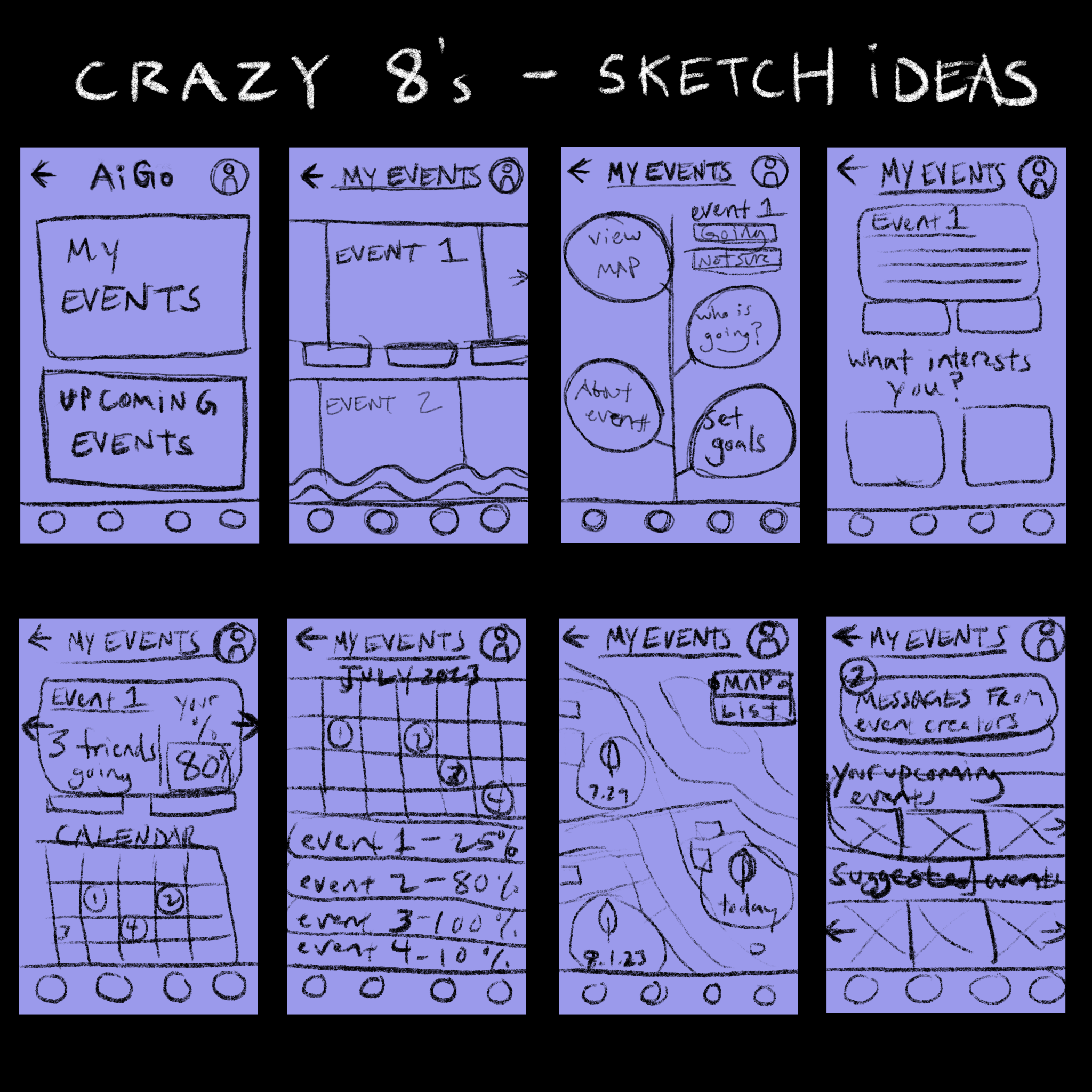

Sketch process of screens for
-event searching
-exploring
-homepage
An abstract journey of social exploration to reward.
Further awarding users with reminders and streaks can cultivate the familiarity and comfort kin with video games.
It starts with the user.
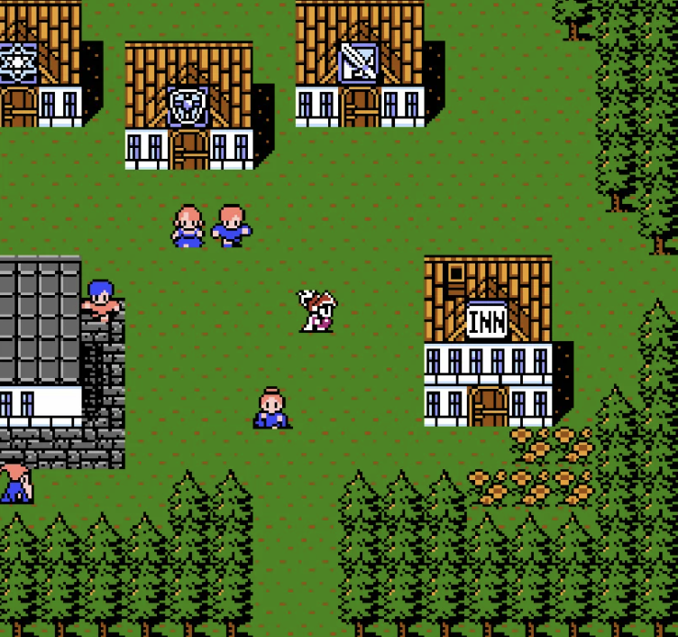
Cartooning and classic gaming visuals -
a way for connecting on a deep level of gaming nostalgia and memory.
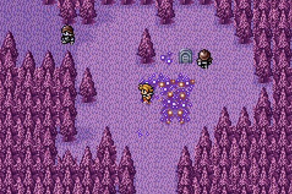
Screenshots from Nintendo’s, Final Fantasy III
Visual Style Inspiration
Purple and Blue = Indigo
Purple hues reflect healing and wisdom,
while blue hues invoke harmony and community.
iGo —> We Go.
The community of blue and the power of purple - Indigo became the primary choice of color influencing the Style Guide
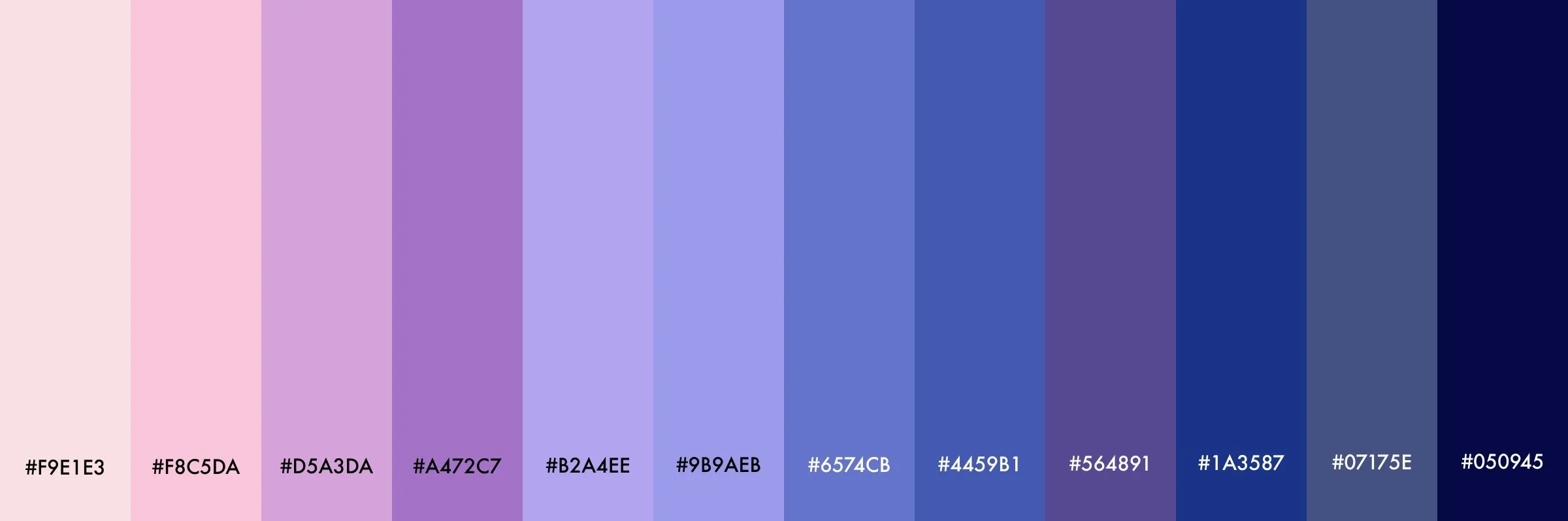
These select shades of indigo represent a collective harmony. The contrast of a soft and warm ambiguous pink paired with a cooler blue-ish purple, create a rich blend of wisdom, tenderness, trust, friendship, and a warm hug.
User Flows
If social anxiety is correlated with social accountability, then our designs must engage our users with other users.
Three user flows were created with social interactions and social possibilities after a user searches and signs up for an event.


By merging the qualities and features of existing meetup apps with dating apps, the foundations of an Information Architecture were created.

Extensive information architecture is needed to meet the needs of the beginnings of a hybrid meet up/dating app.
Paralleling aesthetics and design are crucial to stand with current industry leaders.
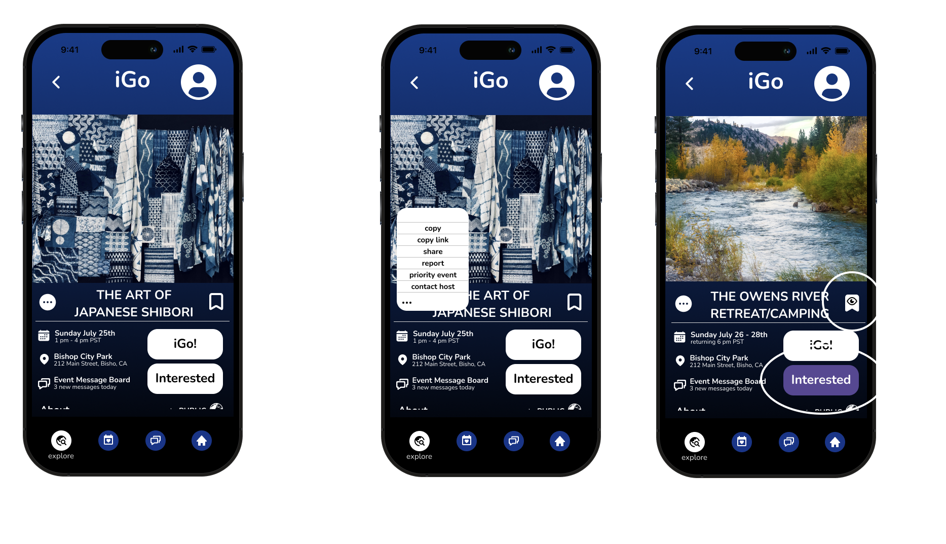
Lo-Fidelity Wireframe Testing
left to right - signing up screens, exploring events on map, RSVPing screens and messaging feature mock-ups.

Testing Results:
Designing screens and wireframes that have elements similar to retro games add to the familiarity feel for users.
Furthermore, after a round Lo-Fi usability testing, solidification of messaging features and its impact on user accountability shifted the focus for Hi-Fidelity MVP mock-ups.
While gamifying, user customization, and adding user check-ins are important, they became secondary focus.
From AiGo to iGo
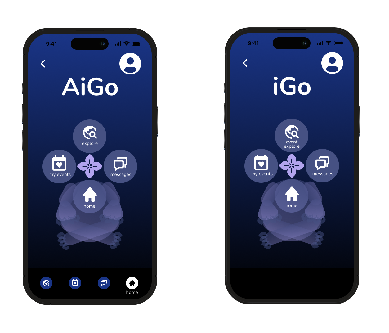
Subtle yet crucial, is brand identity.
Enough user’s struggled with the original name AiGo. Fusing the Japanese word ‘ai’ (meaning love), and the color ‘Indigo’,
AiGo became iGo.
Which still has a similar phonetic to the original.
Hi-Fidelity Screens and
Usability Testing

Committing to the “dark side”
In contrast to industry leaders - creating layout familiarity but, with a primary “dark” mode creates a unique meet-up app aesthetic and experience.
Enriching social features became the primary solution for the design choices.
Features Inspired by Dating Apps
Hybridizing the feel of a dating app after a user signs up for an event created a sense of realness for the event through successfully reported user tests.
The dating app feature was only recognized through user’s who were under 50 years old.
Target audience is crucial.
Furthermore, adding customizables, filters, and other features helps to show user’s whom might need help attending the event, like catching a ride or carpooling.

Design Iterations
Before
After
Users did not know how to enter the event until the addition of an icon representing a clickable helped.
Furthermore, an additional compass was added on the bottom left of the map because users did not know they could scroll in the prototype on Figma.
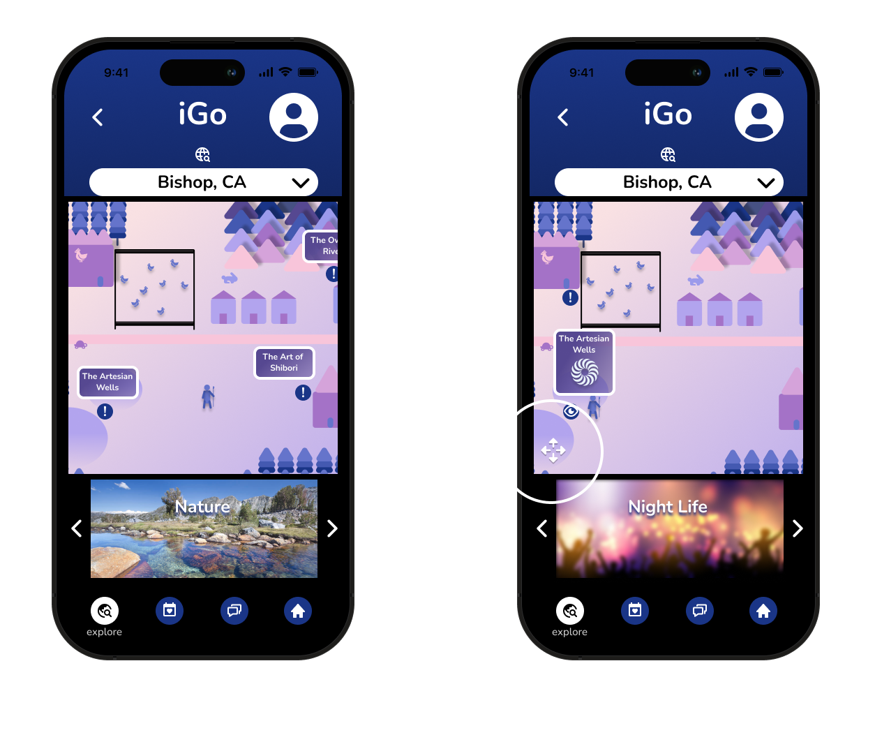
User’s reported a sense of refreshing UI aesthetics
that help with exploring further.
Cartooning and Gamifying
UI aesthetics that match hand-held retro gaming may cultivate and engage more active users.
Buttons and clickables were added after Round 1 testing to polish and create less confusion.
Summary/Findings
Accountability is the biggest factor of “showing up”. Therefore, mixing what works and what does not work with pre-existing apps [such as facebook and eventbrite] to help shape iGo is not conclusive enough to understand what really makes or breaks a user to “show up”.
However, what is understood is people are affected by people. The more users engage with other real users, the more likely accountability comes into play.
Next steps for iGo involve adding user streaks and other gamified features to further enrich the social possibilities that impact our social human nature.
Thank you for scrolling! :)