
E-GUARDIAN
Bridging the gap for Community Health Workers
E-Guardian connects its users to health resources
and the community around them.


Project Overview
SoulTech Medical is currently beginning design phases of E-Guardian - their newest digital platform
connecting Community Health Workers to their target audience of Older African American Adults,
and their trusted family of friends.
E-Guardian and SoulTech Medical are alias names for a real world client with confidentiality agreements - the
following content, examples, and screens may be altered and/or censored here.
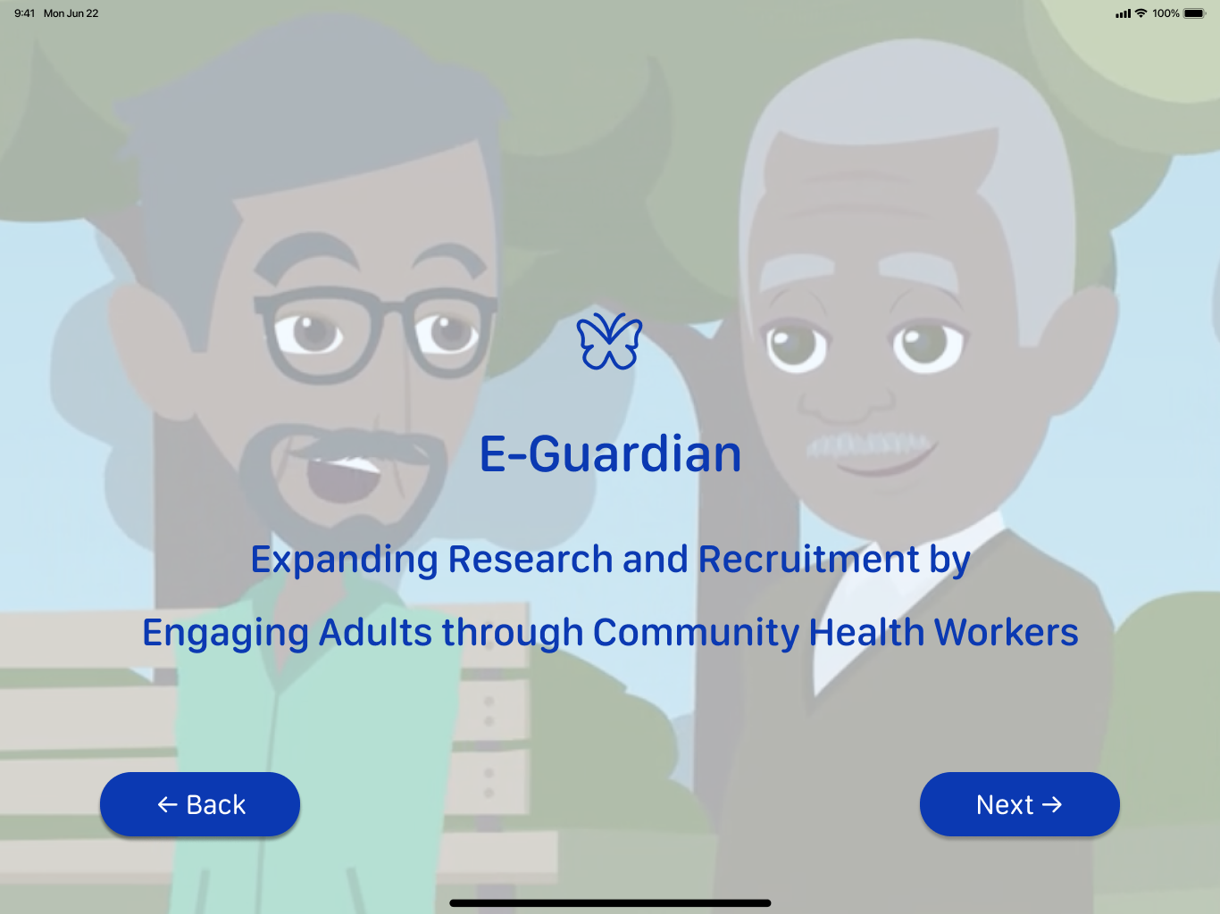
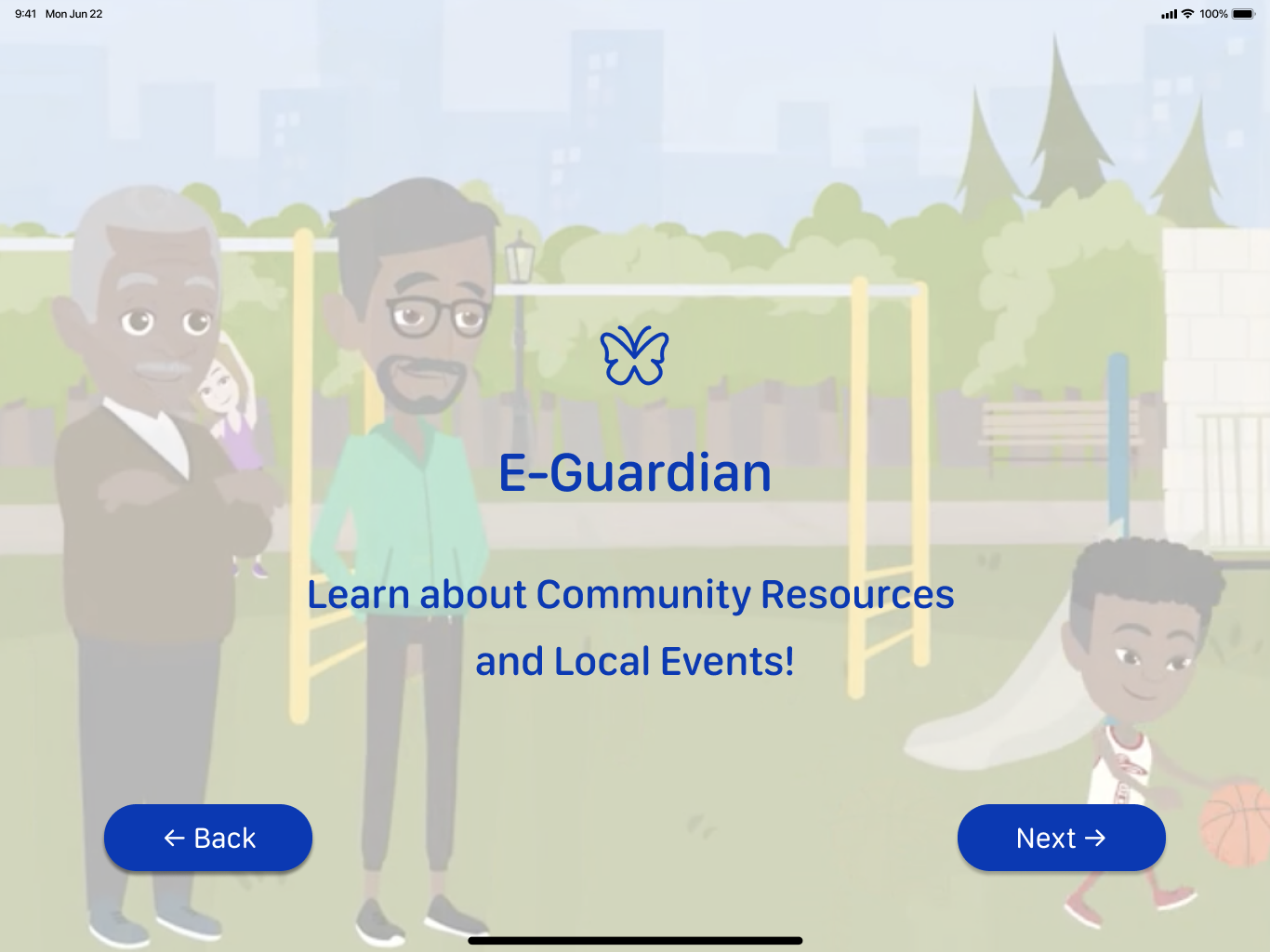
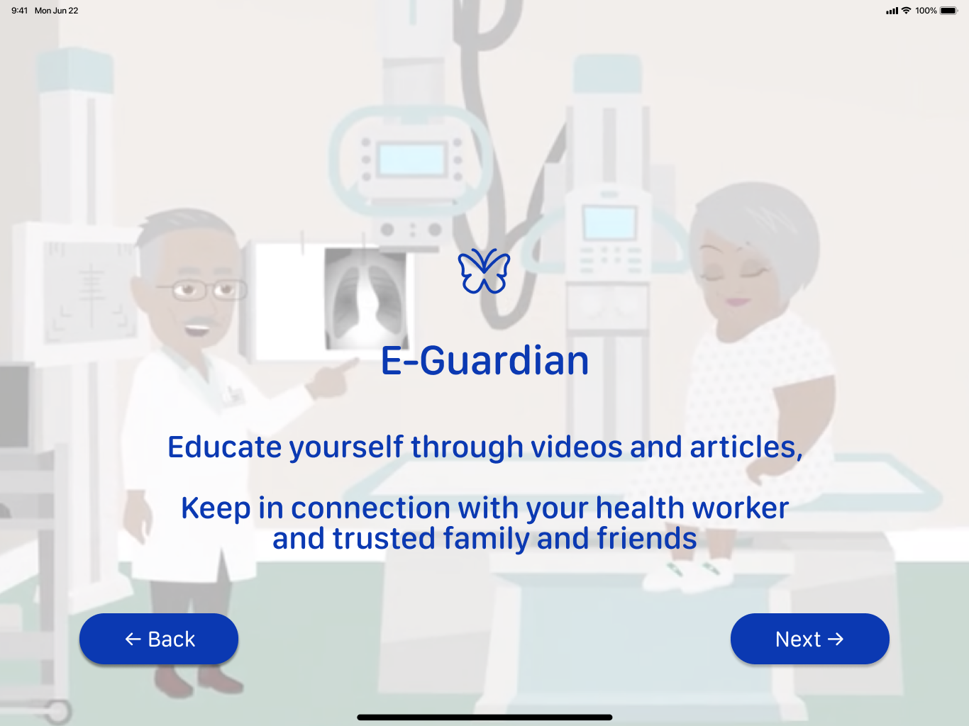
sample hi-fidelity screens of E-Guardian’s onboarding
PROJECT MISSION AND
CHALLENGES

Many hardships have created obstacles for African American Older Adults to lack in education, transportation, and health care services.
In result, they are prone to higher risks of chronic diseases, such as diabetes, dementia, and hyper-tension.
Creating accessible technological resources for Health Workers to connect more efficiently with these group of older adults is the aim for SoulTech Medical and their newest digital product, E-Guardian.
Accessibility and clean UI is the main need.
DESIGN ROLES AND PROCESS
Empathize - Ideate - Decide and Design - Test and Validate
Our role as Designers were to take their current deliverables and make improvements to them.
The next main task was to then focus on transitioning their lo-fidelity screens to hi-fidelity screens…
EMPATHY AND RESEARCH DISCOVERY CALIBRATION
Our three person team was presented with research, and empathy discoveries through deliverables such as User Personas and User Story Map sketches.
Below are examples of two main user group Personas for E-Guardian - the Community Health Worker (CHW) and Community Member (CM) and an exchange between those two users expressed through a storyboard map.


Through calibrating and contextualizing our client’s research and ideation work for E-Guardian, we were able to understand and improve changes needed to the initial user flows before diving into style decisions and lo-fi to hi-fi screen conversions.
FLOW IMPROVEMENTS

STYLE GUIDE IDEATION CONCEPTS
As a team, ideating and deciding on the Style Guide was our biggest challenge to meet our client’s needs.
After presenting three different mood board concepts we could later decide unified final icon styles/buttons, type/font, and color schemes.


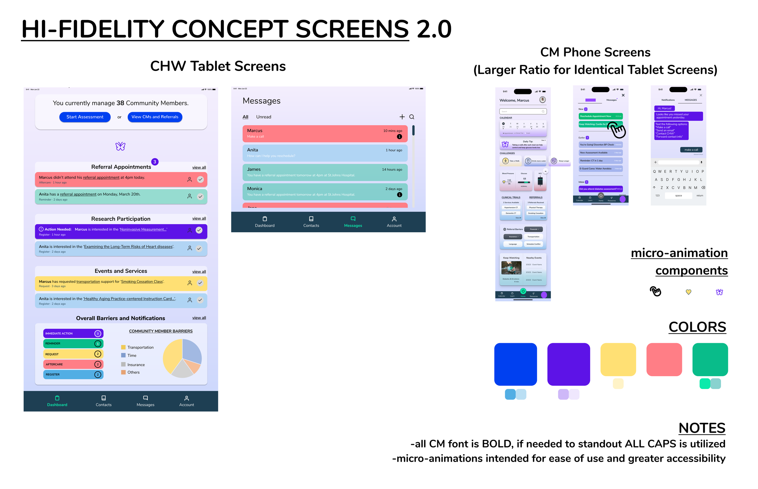
After visual aesthetic decisions were made, we could start testing these styles as Hi-Fidelity ‘Concepts’ for mobile and tablet devices to present to our client.
DECIDE AND DESIGN
We delegated this next phase by types of users and types of device screens between our team of three.
My main task focused on CHW tablet screens specifically for “Onboarding” and “Assessment Review” user tasks.
Health Worker Homepage
lo-fidelity to hi-fidelity
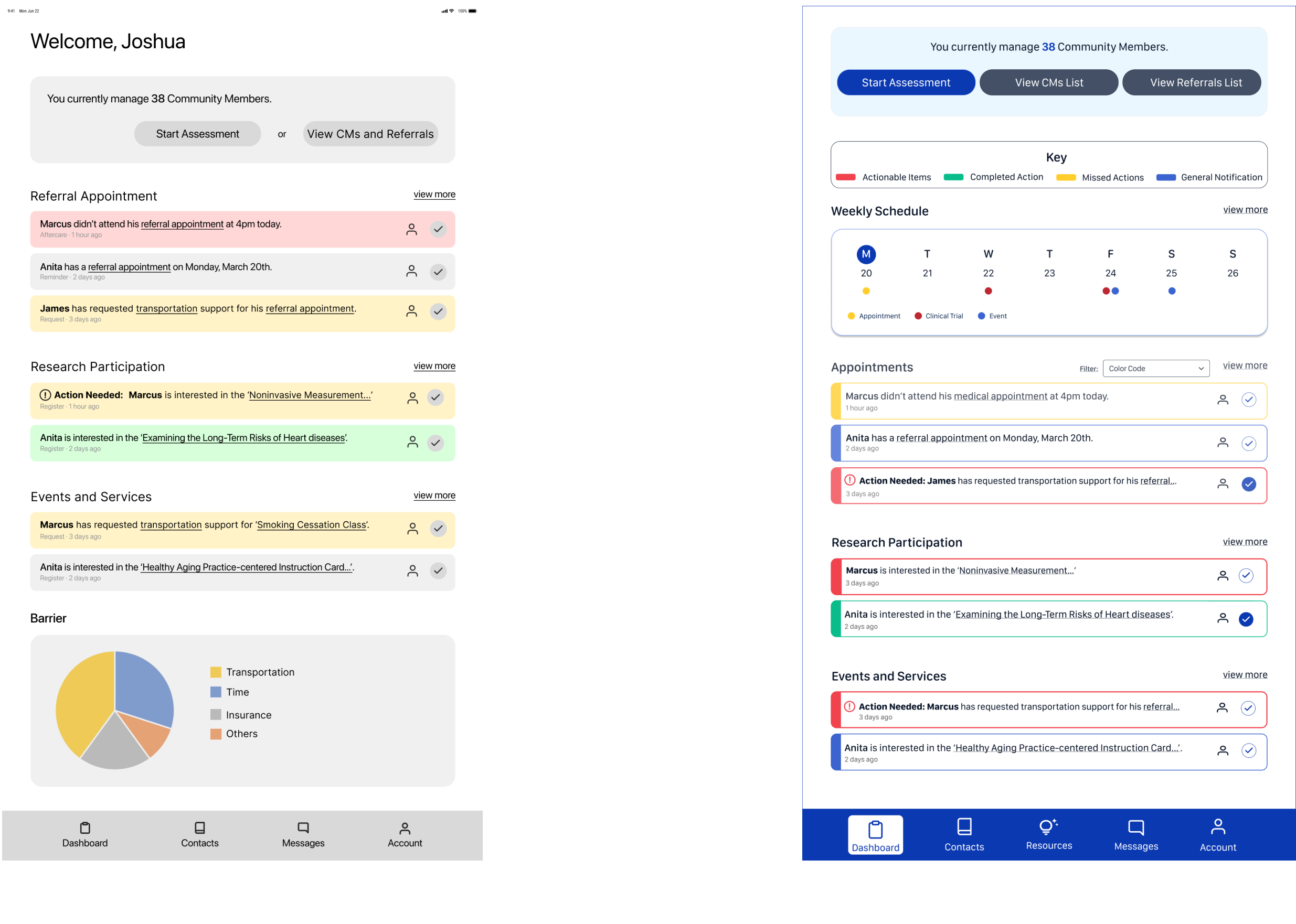
After multiple iterations of the CHW homepage, I was able to fully understand our client’s visual needs!
This paved the way for strongly improved High Fidelity UI creation for my tasks of the CHW tablet screens:
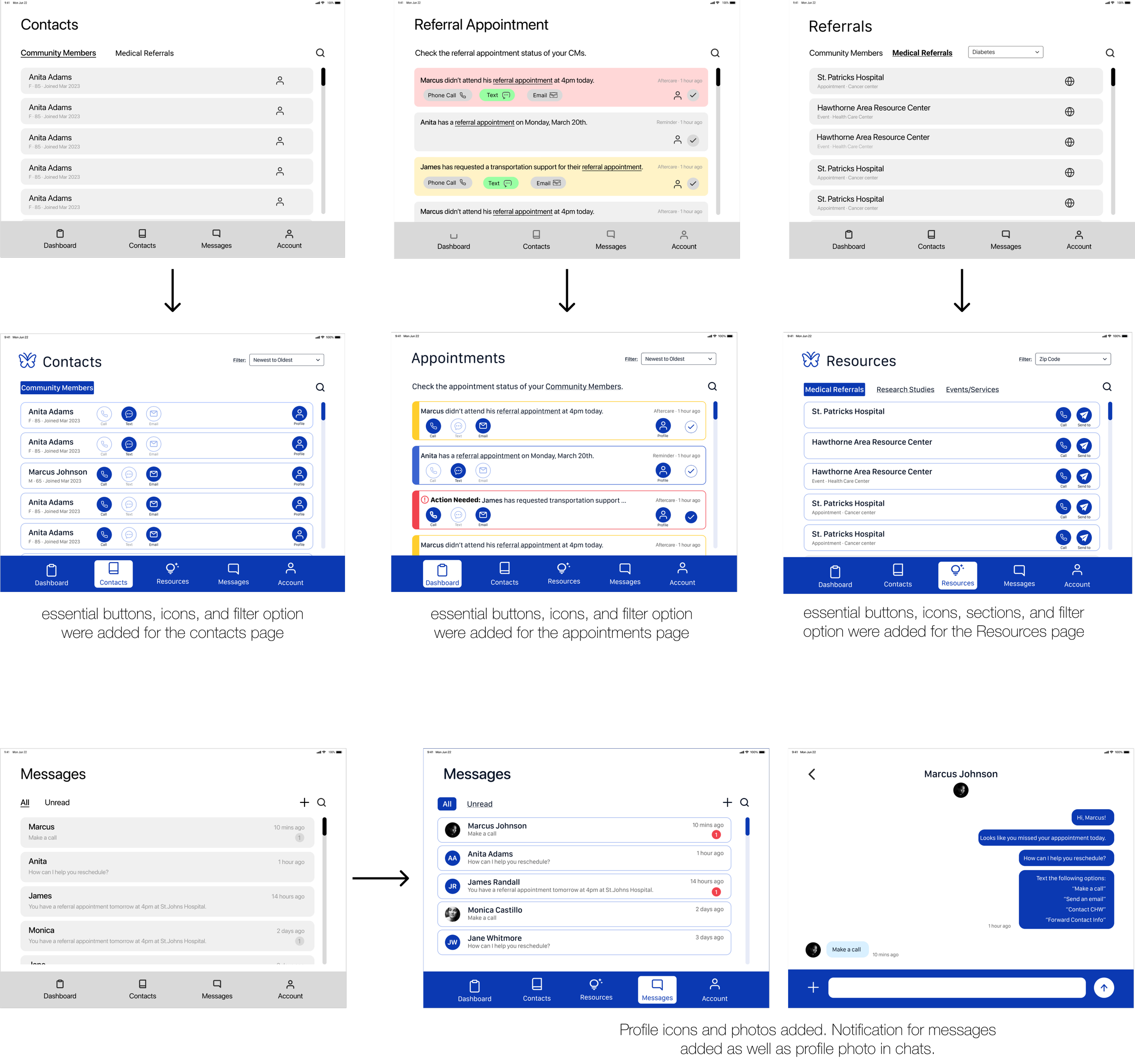
Tablet / Desktop Screens -
Onboarding

TESTING AND VALIDATING
By creating specific set of screens for one task - “Onboarding” and testing and validating them with our client, it allowed smoother and successfully improved Hi-Fi Screen changes as well for various in-app User tasks and features for the Contacts, Appointments, and Messaging Screens.
SUMMARY
After more iterations of the Hi-Fidelity screens based off our client’s feedback, I was able present to them a prototype for the entire Onboarding and Assessment tasks for their upcoming Usability Testing phase (the showing of the clickable prototype breaches our disclosure agreement therefore, it is not available here).
Furthermore, I created and expanded upon confidential features of E-Guardian that practiced my micro-animation skills for iconography, avatars, and more (again, those cannot be shown here)
In these 5 weeks as a team, we were able to produce a ‘Style and Reference Guide’ for future work deliverables, edited User Flows, and also re-iterated and improved UI screens ready for prototyping and testing.
Thanks for scrolling :)